After reviewing my draft and gaining feedback from my peers, I was able to identify areas that I could improve on. Shown below is my final front cover draft.
Tuesday, 27 January 2015
Friday, 23 January 2015
Cover Construction: Colour Changing
I wanted to add some colour to separate some of the cover lines on the left hand side.
I changed the colour and font of all of the cover lines to break up the text. I also added lines above and below "The most exciting acts on earth" to separate it.
Cover Construction: Cover Lines
I thought that one of my cover lines, "10 top gigs to check out in 2015" was too noticable so I decided to change it.
I decided I liked the coverlines aligned to the right or left rather than the middle. So I changed "The most exciting acts in earth" to be aligned to the left.
I also thought that I could make better use of the space so I decided to move the cover line down so that I could move the puff over to the right side so that I can fit in another cover line on the left hand side.
I also moved the website over to the left side so that the cover looked more structured.
I decided I liked the coverlines aligned to the right or left rather than the middle. So I changed "The most exciting acts in earth" to be aligned to the left.
I then added another cover line in the space.
Thursday, 22 January 2015
Cover Construction: Main Cover Line
I thought that the main cover line didn't stand out as much as I would like it to, so I decided to make "Alexa Williams" larger, from 90pt to 120pt.
I also decided to change the colour of "Williams".
I then moved the text slightly to make better use of the space.
Cover Construction: Strapline
I wanted to include a strapline at the bottom of the magazine so I could include more information. I moved the cover lines and barcode up so I could fit in a strapline.
Wednesday, 21 January 2015
Cover Construction: Skyline
I decided that I wanted to add a skyline to my magazine so that I could include more information on the cover and encourage more people to buy the magazine. To do this I had to rearrange some of the cover lines and move the masthead down slightly, without covering my model's face.
First, I decided that the slogan "think loud" was too large and obvious and attracted to much attention. I decided to move the slogan below the masthead and change the colour so that it did not stand out as much. I had to move a cover line down to allow room for the masthead to move down so I could fit a skyline.
After changing the colour of "THINK LOUD" to the light grey I decided that all of the text around the masthead should be coloured in the same grey so that they do not detract from the masthead.
I feel that this is much better as the masthead is more prominent at the top third of the page. However, I thought that the masthead should be coloured black to stand out from the skyline, but also so that my model draws more attention.
First, I decided that the slogan "think loud" was too large and obvious and attracted to much attention. I decided to move the slogan below the masthead and change the colour so that it did not stand out as much. I had to move a cover line down to allow room for the masthead to move down so I could fit a skyline.
Moving everything down gave me the room to add a skyline.
After changing the colour of "THINK LOUD" to the light grey I decided that all of the text around the masthead should be coloured in the same grey so that they do not detract from the masthead.
I feel that this is much better as the masthead is more prominent at the top third of the page. However, I thought that the masthead should be coloured black to stand out from the skyline, but also so that my model draws more attention.
Cover: Adding a puff
I decided I wanted to add a puff to my magazine. I found a circle shape vector online. It recoloured it to light grey so it wouldn't stand out too much.
I then added text to the puff and used the warped text tool to make the top and bottom line curve around inside the shape.
I then inserted this into my cover and moved the cover lines around to fit it in.
Tuesday, 20 January 2015
Peer Feedback on First Draft
Here I have gathered feedback from different peers. This will show me areas for improvement for my 2nd draft.
Monday, 19 January 2015
Front Cover First Draft
Below is my first draft of my front cover. I can now get feedback from my peers and find out where I can make improvements.
Sunday, 18 January 2015
Adding a Barcode & Social Media Icons
I wanted to add a barcode to my cover to make it look more professional. To do this I used Photoshop and re-sized it to fit my cover.
 |
| My barcode |
I also wanted to add social media icons to my front cover to make it look professional and plug the social media accounts. This can encourage readers to be more interactive with the magazine and in this digital age I feel it is a important aspect of marketing any product. I searched for free social media icon vectors and found some on DreamStale that I was happy with and I thought suited the look of my magazine. I decided to use three popular social media icons: Instagram, Facebook and Twitter.
I then added these two elements to my main cover at the right bottom corner.
Saturday, 17 January 2015
Music Magazine Cover: Masthead & Slogan Font
Now that I have created my image I need to start adding cover lines. I found my fonts from dafont as this gives me a wider range of fonts to choose from. First, I wanted to find a suitable font for my masthead. I searched through the popular fonts until I found one I was happy with. I wanted a font that was large and clear, without being too boring. Eventually I decided on Stenha. I also decided to use this font for my slogan.
 |
| My masthead in "Stenha" |
 |
| My cover so far |
Cover: Cover Line Fonts
For my artist's name I wanted to use a font that looked handwritten. I searched in the "handwritten" section of dafont. I decided on Cheddar Jack as I liked the look of the font as it was interesting and easily read.
For my cover lines I decided to use a font called Big John/Slim Joe that I found on Behance. This include a bold font suitable for headlines and a thinner font suitable for smaller cover lines. Using different fonts allows for some diversity on the cover and improves it's overall look. I used the font Big John on the month and the website. I have positioned them at the top of the cover so they don't detract from the cover lines.
For my cover lines I decided to use a font called Big John/Slim Joe that I found on Behance. This include a bold font suitable for headlines and a thinner font suitable for smaller cover lines. Using different fonts allows for some diversity on the cover and improves it's overall look. I used the font Big John on the month and the website. I have positioned them at the top of the cover so they don't detract from the cover lines.
I then added the cover lines around the main image.
Friday, 16 January 2015
Main Image: Resizing
Next I needed to edited the cracks out of the background of my main image and edit the image so that it was the size of A4 paper. Instead of just resizing the image to A4 size, I wanted to edit the image so that I had more room to work with at the top and sides of the image. I used the clone stamp tool to get rid of the cracks in the wall and then extended the image to the correct size.
To ensure it was the correct size I created a new canvas and made chose international paper, A4.
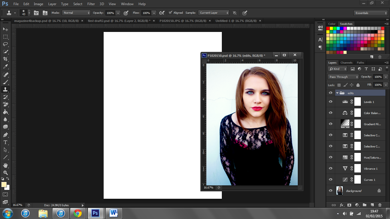
I then copied the image into this window and re-sized it until I was happy with image.
Shown below are the old image (left) and the new image (right). As you can see the new image has a lot more space above my model's head, for my masthead, and the sides have more space for cover lines.
To ensure it was the correct size I created a new canvas and made chose international paper, A4.

I then copied the image into this window and re-sized it until I was happy with image.
Shown below are the old image (left) and the new image (right). As you can see the new image has a lot more space above my model's head, for my masthead, and the sides have more space for cover lines.
Main Image Editing
To begin constructing my cover I wanted to edit the image to make it stand out more. I added different adjustment layers and played around with them. These were small differences but I feel they create a big difference in the quality of the image.
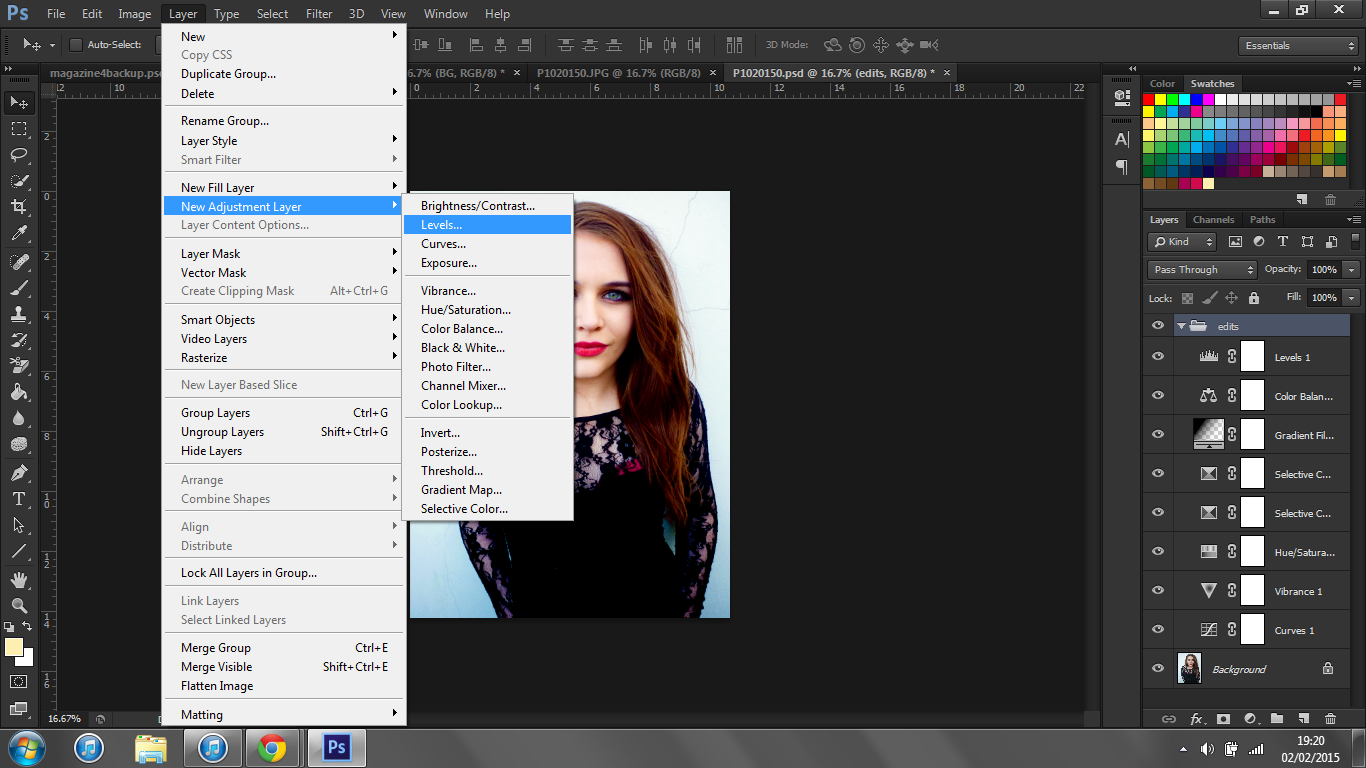
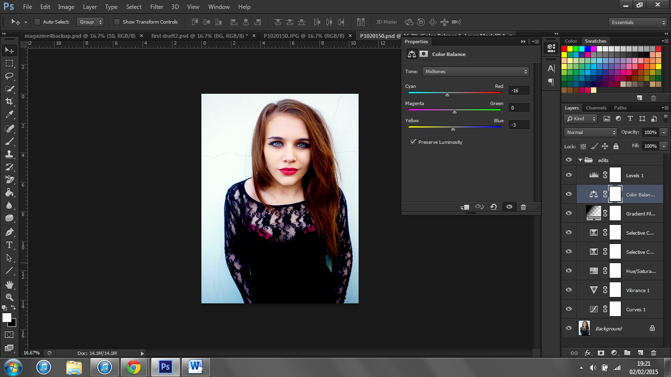
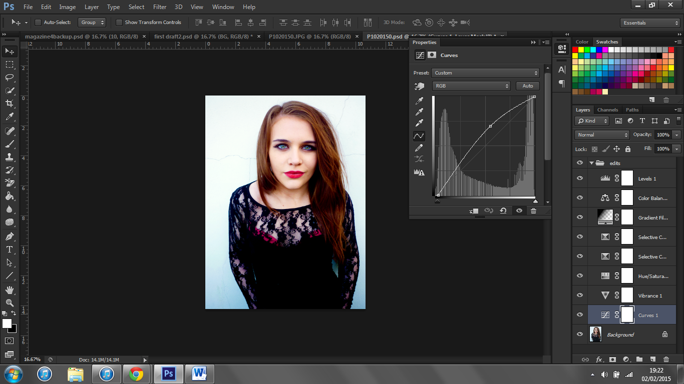
I also removed blemishes and smoothed my model's skin.
Eventually I had created a look that I was happy with. I feel that this image is much more striking than the original.
The original picture along with the finished edited version are shown to the below.


I also removed blemishes and smoothed my model's skin.
Eventually I had created a look that I was happy with. I feel that this image is much more striking than the original.
The original picture along with the finished edited version are shown to the below.

Music Magazine Cover: Main Image
I have chosen to use Adobe Photoshop to make my front cover. I chose to use this instead of Adobe InDesign as I find it easier to work with having prior experience with Photoshop. I have never used InDesign before and under the time constraints I felt that it was more appropriate to use Photoshop.
For my main image I decided to against the most popular choice in my target audience feedback as I thought this image would be easier to work with in terms of fitting cover lines around it. Shown below is my unedited chosen image.
For my main image I decided to against the most popular choice in my target audience feedback as I thought this image would be easier to work with in terms of fitting cover lines around it. Shown below is my unedited chosen image.
Thursday, 15 January 2015
Padlet for Photograph Feedback
After taking my photographs I wanted to get some feedback from my target audience. To do this I uploaded a selection of them to Padlet. This allows users to scroll through the pictures and leave comments with their feedback. I then posted the link to my social media sites Facebook, Tumblr and Twitter. Below you can view my Padlet and screenshots of the links on my social media sites.
Tuesday, 13 January 2015
Photograph Collection
Shown below is a collection of my photographs. I have displayed them like this so you can view the different variety of shots/angles etc. I have tried to include a range of different types of photographs so that I have a lot of choice so I can use the best ones in my magazine to ensure that it looks professional.
Sunday, 4 January 2015
Music Magazine Photo-shoot Plan
Shown below is my photo-shoot plan. Creating this allows me to get all of my ideas down for the photographs down on paper. I will refer back to this when taking my photographs for my magazine.
Friday, 2 January 2015
Music Magazine Flat Plans 2
Shown below are my second set of flat plans for my magazine.
In this flat plan I have included a skyline. This will plug some features in the magazine. I will colour this black so it stands out. The masthead will be positioned at the top third of the magazine cover. This is typical for most magazines due to the positioning of them in newsstands. I have done this so people will be able to easily and clearly view the name of this magazine so they will be able to recognize it in the future.
I have placed cover lines at both sides of the magazine cover. The main image will be the background of my cover, so the cover lines will be placed over it. The cover lines would displaying headings and small blurbs about new features, rather than regular features. This will attract people to pick up the magazine. The main image will be of the same artist featured on the double page spread, and the pull quote will be from this article. The main image is important as it is often the first thing a person notices when looking at a magazine.
I have positioned the barcode at the bottom right corner so it is easily seen,but doesn't distract from the rest of the cover.
In this flat plan, I have decided on two pages to include more information.This will attract new readers as they are able to get a feel for the type of magazine this is and what the content they can expect. I have positioned the title on the left page where it is easily seen along with the masthead. I have done this so there is a clear house style across my magazine. This will also help people become familiar with the masthead so it will be more recognizable to them. The contents are split into different headings. I have will use many different images to improve the aesthetics of the overall pages. I have included a thumbnail image of my cover as this is typical of a lot of magazines.
In this flat plan I have divided the article into three columns so that it is clear and easy to read. This will also ensure that the page is neat and professional looking, as my target audience will appreciate this. I will include drop caps at the beginning of new paragraphs. I have made the main picture of the artist one full page and I have positioned the name of the artist at the top of the second page. This makes it very easy to quickly see who the article is about. This makes it easy for people who are flicking through the magazine to immediately see who the article is about. Underneath the name of the artist I have included a small blurb about the article so the reader knows what to expect before reading the article. This would entice readers to continue to read on. At the bottom outer corners I have included the issue date, masthead and page number. These are positioned typically so that readers can instantly and easily find the page numbers. The issue date is included to make the magazine look more professional and the masthead initials have been included so the house style is evident throughout the magazine.
Subscribe to:
Comments (Atom)


.JPG)


